 Download CV
I Designed Mobile LMS That Teachers Actually Use Making Teachers Engage More
2.3x More Teacher Engagement
ROLE
Lead Product Designer
TIMELINE
10 weeks (2021)
TEAM
2 Designers, 3 Developers, 1 PM, 1 Content Strategist
The Challenge
The existing LMS was built primarily for desktop, making it difficult for teachers to manage their classes on the go. Many educators preferred using mobile devices, but the web app was not optimized for smaller screens or touch interactions. Navigating complex flows like uploading materials, tracking student progress, or managing assignments became frustrating and time-consuming. This created a major gap in usability and accessibility for one of the platform’s most active user groups.
As we analyzed usage data, we found that teachers struggled with complex navigation, slow load times, and unclear indicators of student progress. The platform’s limited accessibility and lack of responsive design left mobile users frustrated, resulting in low engagement and course-completion rates.
78%
Teachers accessing the LMS via mobile
0%
Mobile-optimized workflows
(vs. 74% on desktop)
8.5 min
Average mobile session duration
(vs. 27 min on desktop)
Research & Discovery
User Personas
Based on our research, we identified key user personas that helped guide our design decisions and prioritize features for the mobile LMS experience.
Sarah Martinez
High School Teacher, 34
Tech-savvy educator who teaches multiple subjects and manages 150+ students across 6 classes daily.
Goals: Quick access to student progress, efficient grading on-the-go
Pain Points: Limited time between classes, needs offline access
Mobile Usage: 70% of LMS interactions during commute and breaks
Robert Johnson
Elementary Teacher, 52
Experienced educator with moderate tech skills who values simplicity and clear navigation in digital tools.
Goals: Simple lesson planning, easy parent communication
Pain Points: Complex interfaces, small touch targets
Mobile Usage: Prefers larger text, needs intuitive workflows
User Research
We conducted a comprehensive research phase including contextual inquiries with 18 students, 5 educators, and analysis of usage data from over 50,000 mobile sessions.
01 TIME
Teachers and admin staff spent a large portion of their day preparing lesson plans manually due to lack of efficient tools in the LMS.
02 DIGITAL
After the pandemic, everything moved online but many educational institutions still lacked proper digital infrastructure, leaving teachers struggling with outdated systems.
03 LITERACY
Many educators had limited experience with mobile apps and digital platforms, making it hard to navigate non-intuitive systems.
04 CORONAVIRUS
The pandemic caused enrollment drops and inconsistent attendance, making it harder for teachers to track and manage student progress effectively.
Mobile Learning Patterns
Our analysis revealed that teachers engage with learning content in short, frequent bursts on mobile usually between classes or while commuting. Designing for these micro-sessions required simplified navigation, large touch targets, and offline availability.
Micro-Sessions
Average session length on mobile is 5–10 minutes, favouring quick task completion.
Device Switching
64% of teachers start a task on desktop and finish it on mobile (or vice versa) the same day.
Poor Connectivity
Spotty school Wi-Fi made offline access to lesson plans & materials essential.
Varying Tech Confidence
Interfaces must cater to both tech-savvy and tech-anxious educators—clear copy & big touch targets win.
The Solution
We designed a native mobile app that reimagined the learning experience for on-the-go education. Rather than simply adapting the desktop interface, we created an experience optimized for micro-learning and contextual usage.
Micro-Learning Architecture
Restructured course content into bite-sized modules for 5-10 minute learning sessions with clear progress tracking.
Seamless Synchronization
Implemented cross-device synchronization that allowed users to seamlessly continue their learning across devices.
Offline Access
Created a robust offline mode that allowed users to download course materials for access without an internet connection.
Optimized Media Playback
Redesigned video and audio playback with adaptive streaming, variable playback speeds, and transcripts for accessibility.
User Flow Mapping
After identifying key teacher workflows through interviews and stakeholder discussions, we mapped out a complete user flow to define how teachers would interact with the mobile LMS. This helped us prioritize core tasks like managing students, classes, and schedules, while also ensuring a smooth onboarding and setup process. The flow was designed to reflect real-world usage patterns starting from onboarding and setup, leading to the main dashboard, and branching into high-frequency actions like attendance, salary management, subject assignments, and more. Each path was streamlined to reduce cognitive load and minimize the number of taps required to complete a task.
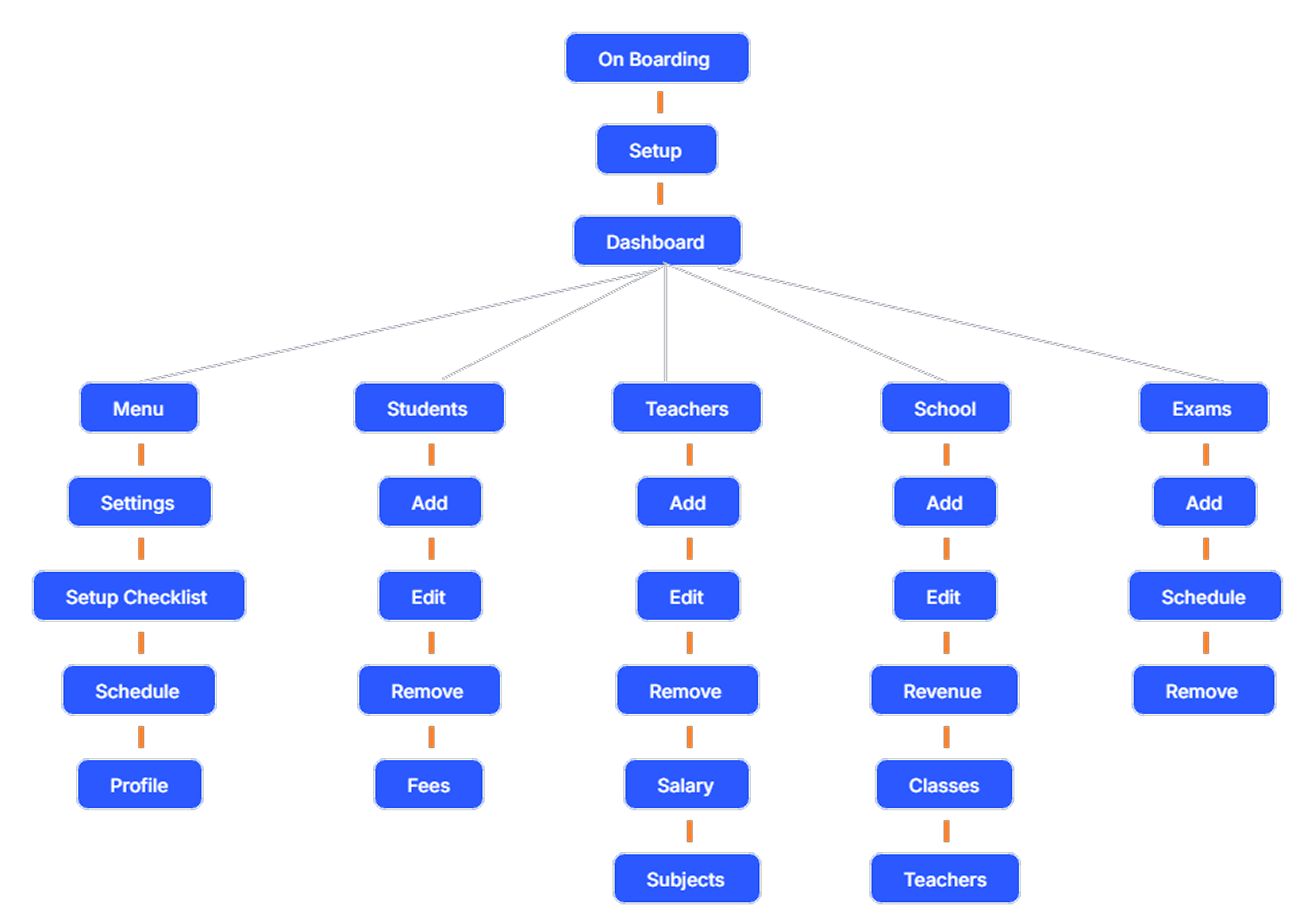
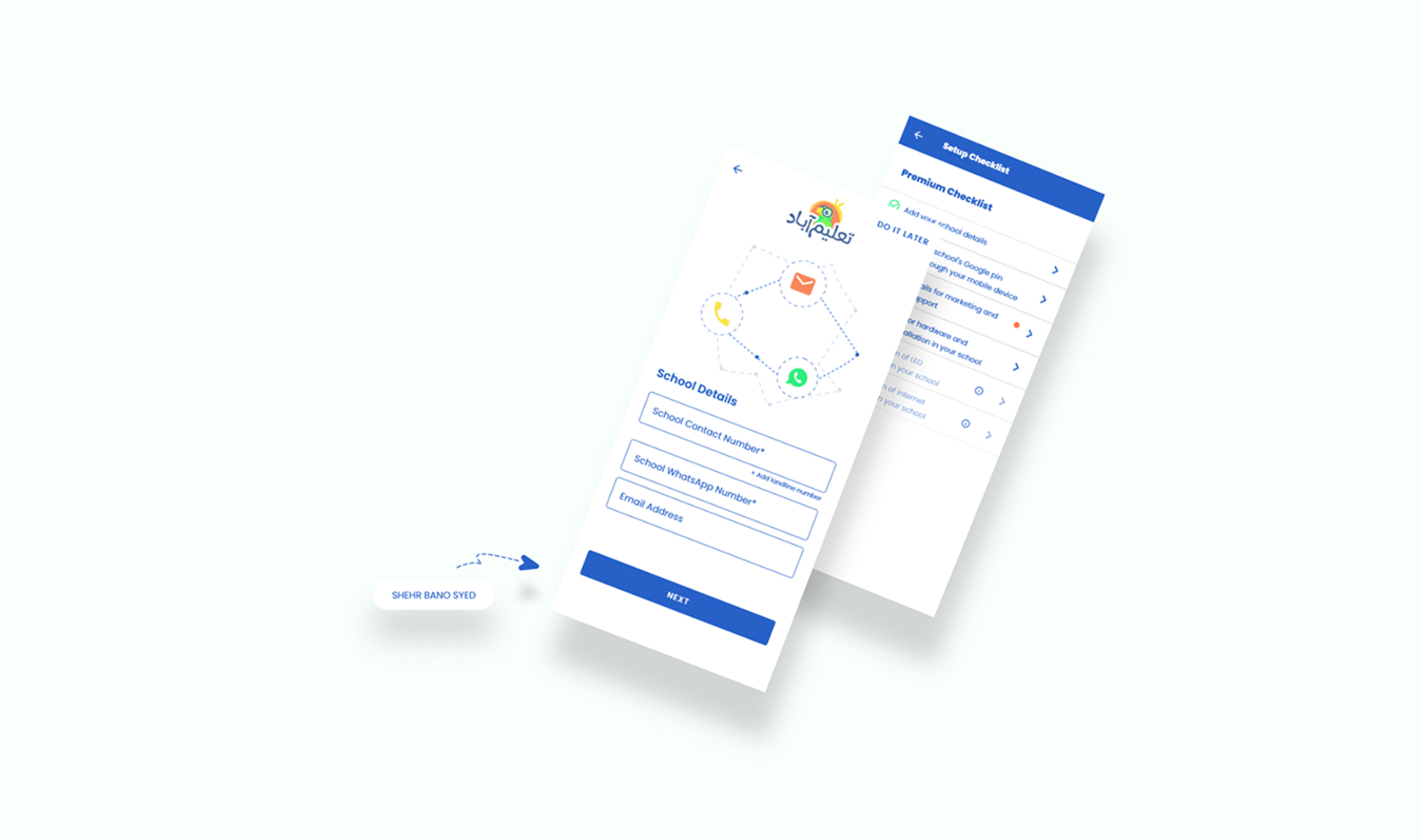
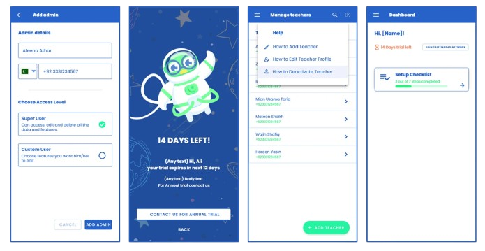
UI Design
Results & Impact
2.3×
Increase in user engagement
measured by daily active users
68%+
Conversion Rate
up from 32%
The redesigned mobile LMS empowered teachers to teach and manage classes on the go — not just mirror the desktop experience but reimagine it for mobile-first behaviors. By addressing mobile-specific challenges like connectivity, usability, and speed, the product fostered real improvements in both learning outcomes and operational efficiency.
This wasn't just a UI win, it was a strategic one. The success translated into business value through better engagement, higher completion rates, and broader reach earning industry recognition with an Educational Technology Award for Mobile Innovation.
Key Learnings
Tech Literacy Can’t Be Assumed
Simpler interfaces enabled adoption across varying tech comfort levels.
Mobile-first ≠ scaled-down desktop
We restructured workflows entirely around teachers’ on-the-go behavior.
Design must reflect context
Teachers needed quick, focused actions between classes not long, complex flows.
Offline functionality is essential
Many schools lacked reliable internet; offline access drove real usage.