How a Fintech Redesign Helped Users Track Spending & Fight Post-COVID Inflation
33%+ conversion rate
ROLE
Product Designer
TIMELINE
12 weeks (2023)
TEAM
2 Designers & PM
The Challenge
Finmo is a mobile application designed to provide resources to users during these challenging times of the economy. My primary goal was to create an intuitive and effective user experience that would help users manage their expenses and resources efficiently. The Finmo app stands out among numerous FinTech apps due to its unique key features.
The problem was the absence of a comprehensive FinTech app that effectively catered to users' needs in managing their finances efficiently. Existing apps in the market were lacking, leaving a significant gap that needed to be filled. The challenge was to create an intuitive, visually appealing app that incorporated both financial planning and expense tracking features, revolutionizing the way users manage their finances.
68%
user drop-off rate during money transfer flows
56%
of support tickets related to spending
<18%
of users were using external budgeting apps
UX Process Timeline

Research & Analysis
User Research
Through research, I gained comprehensive understanding of the target audience's needs and pain points, as well as identify opportunities to differentiate Finmo from its competitors.
| Methods | Purpose |
|---|---|
| Online surveys | Identify patterns and trends in data from a larger group of users |
| Diary studies | Gain insights into users' daily habits and routines, as well as their financial priorities |
| Usability testing | Evaluate the effectiveness of the design and identify areas for improvement |
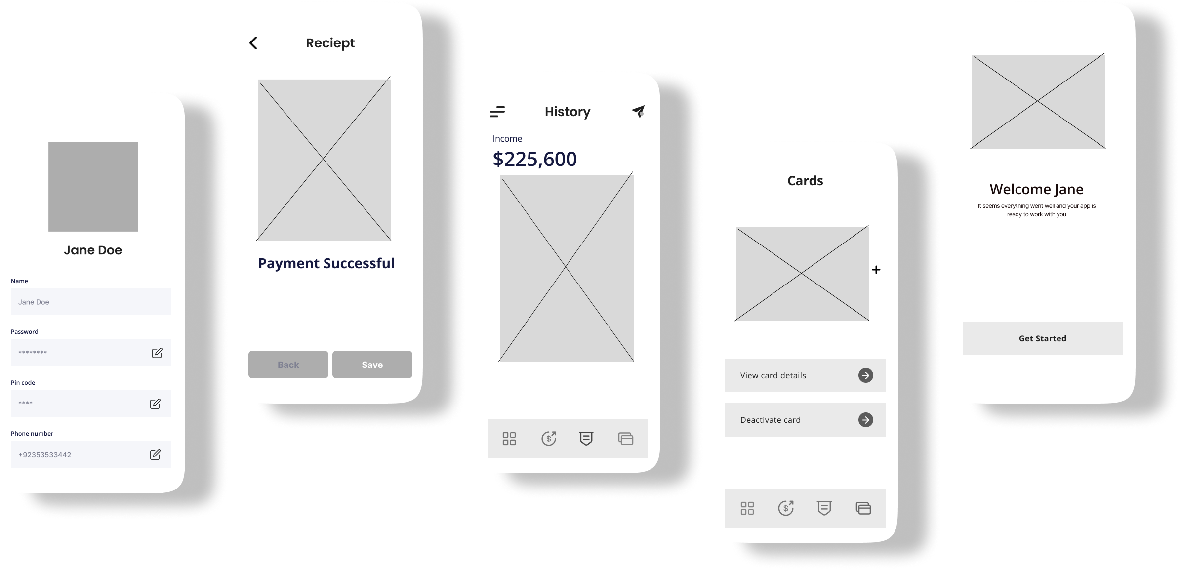
Ideation
The goal was to create a user-friendly interface that would help users manage their finances and resources efficiently. I started by sketching out ideas on paper and then moved on to creating digital wireframes using Figma. I used a card-based design approach to organize information into digestible chunks, making it easier for users to understand and manage their finances. Throughout the design process, I made extensive changes based on user feedback and input from stakeholders. For example: I added a new feature that allows users to track their spending by category, which was a common pain point identified during the user research phase.
Top Drop-off Points
- • Account setup: 45%
- • First transaction: 32%
- • Settings configuration: 28%
Most Used Features
- • Balance checking: 89%
- • Transaction history: 76%
- • Quick transfers: 54%
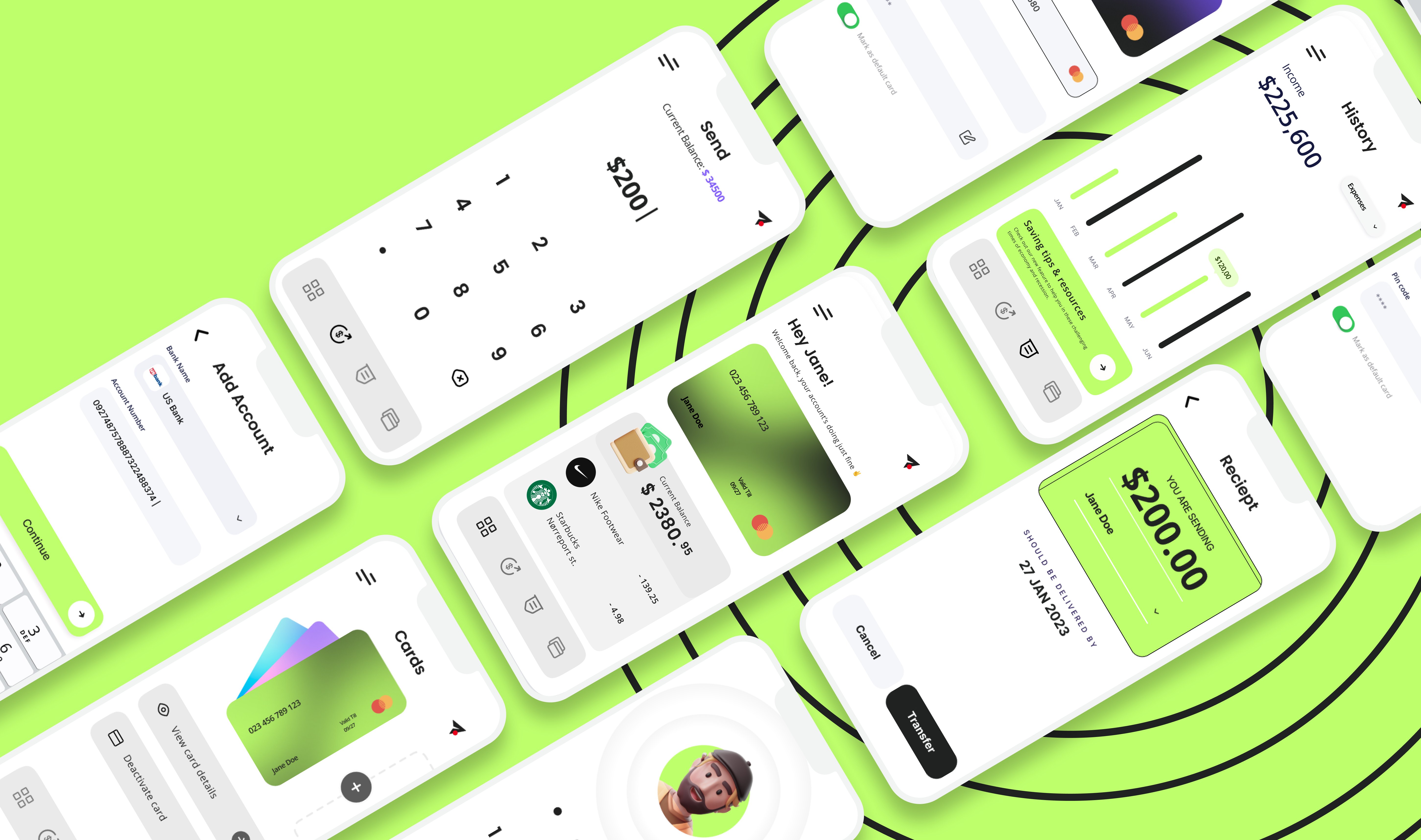
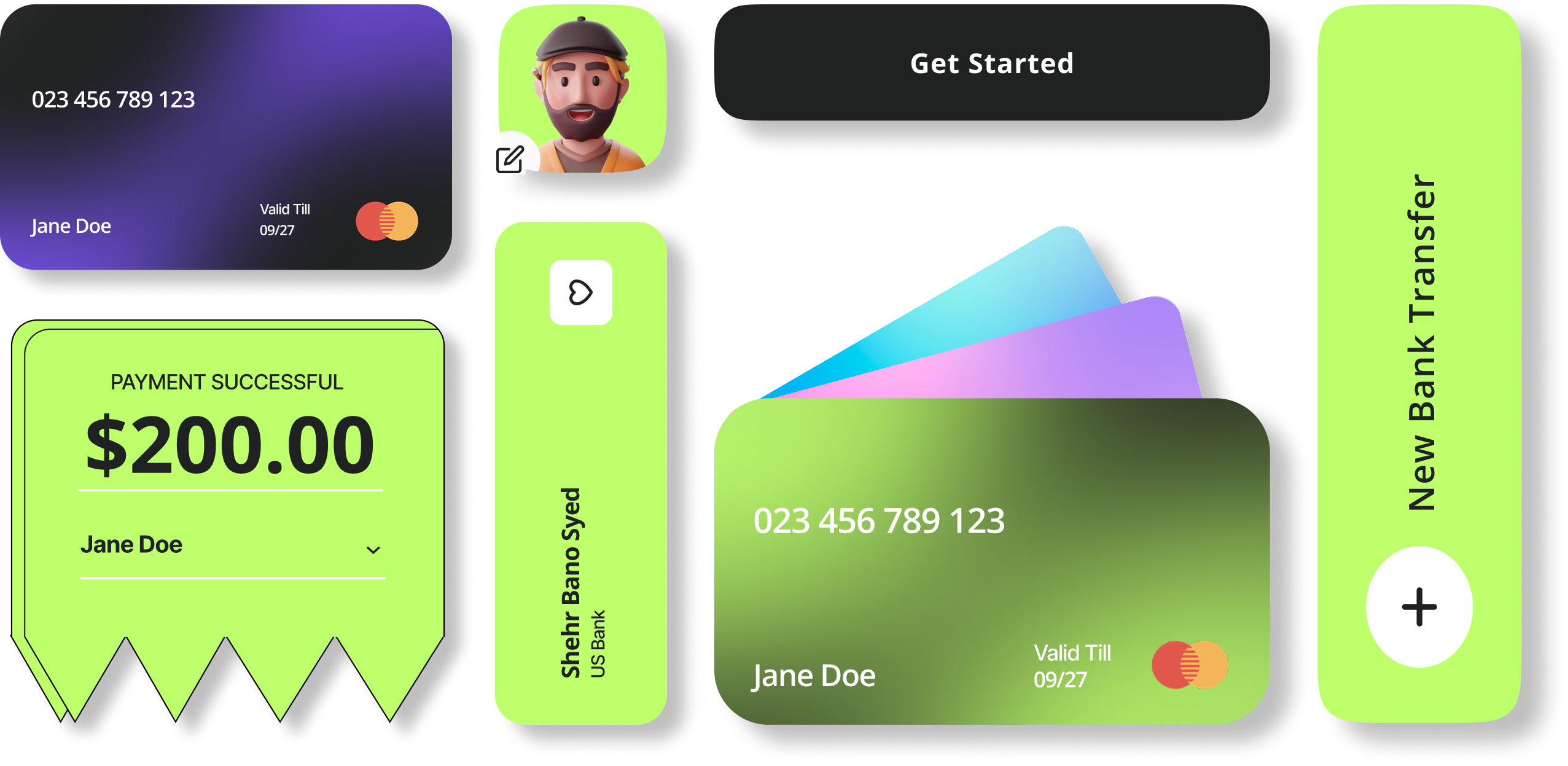
Solution
We redesigned the entire application with a focus on simplicity, clarity, and user empowerment. The new design prioritizes the most important user tasks while providing clear pathways to advanced features when needed.
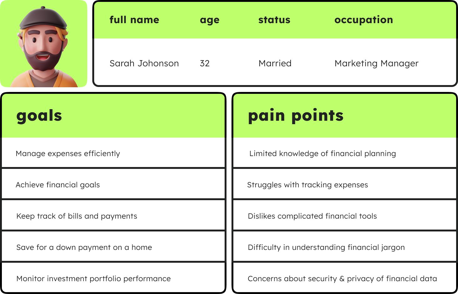
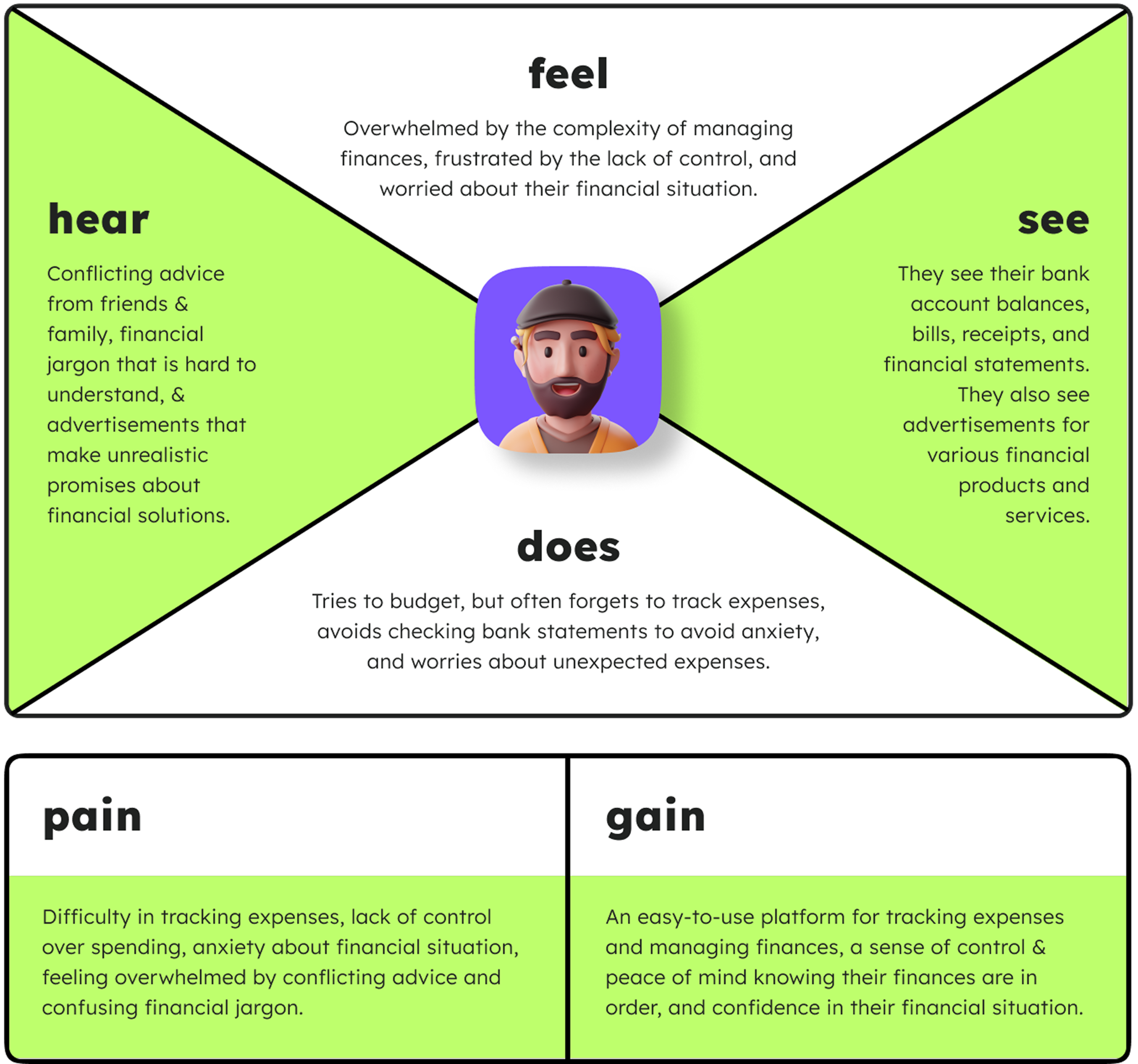
This persona represents a typical user of the Finmo app, with specific goals and needs related to financial management and planning. By keeping Johonson's needs in mind, the app can be designed to address her pain points and provide a seamless user experience that meets her expectations.
Design Process
UI Process
Throughout the design process, I made extensive, iterative changes informed by user feedback and stakeholder input. A key enhancement was the introduction of a category-based spending tracker, directly addressing a common budgeting pain point uncovered during research.
Key improvements driven by research and feedback:
- Translated pain points from interviews and usability tests into actionable design changes
- Aligned feature priorities with business objectives through close stakeholder collaboration
- Implemented a category-based spending tracker that improved users’ financial transparency
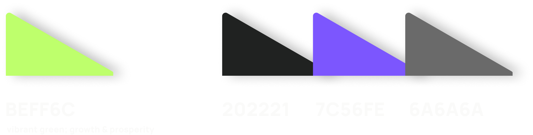
I chose Open Sans for its clean, modern aesthetics and great readability across devices. The vibrant green (#BEFF6C) became the primary brand color, signifying growth and prosperity, supported by a dark gray, a vivid purple, and a neutral gray.
A robust component library ensures scalability and consistency. All patterns follow accessible color contrast ratios and allow rapid iteration in Figma and code.
Prototyping & Testing
To ensure the final experience aligned with user needs, we developed interactive prototypes and conducted four rounds of usability testing with eight participants. Each round informed iterative design changes, gradually refining the product and validating every decision.
Testing Methodology
- Task-based usability testing for core flows
- A/B testing to evaluate navigation and onboarding variations
- Accessibility & performance testing to ensure inclusive experiences
Key Iterations
- Simplified transaction flow and improved error states
- Enhanced visual feedback during loading sequences
- Streamlined onboarding with contextual hints
UX Walkthrough
Results & Impact
30%
Increase in user engagement
measured by daily active users
61%
New app store rating
up from 3.2/5
The redesigned fintech application successfully transformed the user experience, resulting in significant improvements across all key metrics. User feedback was overwhelmingly positive, with many praising the app's new simplicity and clarity.
The business impact was equally impressive, with increased user retention, higher transaction volumes, and reduced customer support costs contributing to a 25% increase in overall revenue within 6 months of launch.
Key Learnings
User Research is the Foundation
Research and analytics uncovered real user pain points beyond surface-level assumptions.
Simplicity Wins
In fintech, clarity beats complexity. Streamlining reduced friction and boosted satisfaction.
Trust Through Transparency
Clear communication around security and errors reinforced user confidence.
Iterative Design Delivers
Multiple test-and-learn cycles refined the product for diverse scenarios.